Colour Collab: Pippa Ensor
Athfield Architects associate Pippa Ensor has worked in all three of the practice’s studios, with a foray into architecture in Stockholm and London in between. She is currently based in the Christchurch office where she works on a range of project typologies, with a current emphasis on educational spaces. In this Colour Collab with Resene, she takes colour inspiration from birds and their habitats.
You were part of the design team for the award-winning Lyttelton Port Company building, Waterfront House, in 2019. Tell us about your experience.
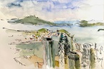
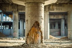
Pippa Ensor (PE): It was a fantastic project – both challenging and rewarding. As project architect, I worked with Kim Salt, a colleague from our Wellington studio, to develop the interiors. In terms of finishes, they had to be both durable and practical. We drew from the surrounding location, with the Port Hills in the distance, and combined the rusty-red Resene Fahrenheit with greens, reds and blues from the Resene Colorwood stains range. We were very humbled to receive two Resene Total Colour Awards for the project: the Commerical Interior Office Award and the Master Nightingale Award for the overall winner.
The rusty red presumably references the ubiquitous red oxide of the port’s shipping containers?
PE: Yes, we were looking to create familiarity and connection – a building that has grown from the port, for the people of the port. Colour is a compelling way to connect, as is material use. We took old wharf timbers and used them in the cladding, the steel, crane-like structure was celebrated and, inside, meeting pods were clad in rough-sawn ply with expressed timber battens. Resene Kumera, Resene Totem Pole and Resene Pickled Bluewood stains used in the pods almost act as a watercolour – applied over timber, they allow the material’s texture to shine through. There’s a real honesty about that.
How do you use colours to add to a space?
PE: We’re very conscious of the role colour plays – in terms of familiarity and personality. And, practically, it helps with wayfinding and variation in an otherwise quite open-plan space. There are similar conversations in educational spaces – each block might have a different colour associated with it, for example. Colours can add so much life and personality to a building, which it otherwise might not have.
In your spare time, you draw and paint. What are some of your most recent artworks?
PE: I’ve just finished a series of watercolour illustrations for a children’s book, written by a talented friend of mine, author Kate Preece. Its working title is One Weka Went Walking and it follows a weka on his adventures around the Chatham Islands as he meets a number of endangered native birds. It’s been a great excuse to get back into drawing. I’ve always drawn when I can – it is both a useful tool within my design work and an enjoyable way to take time out to experience a place in a different, often slower, way.
What was the inspiration for your collaboration?
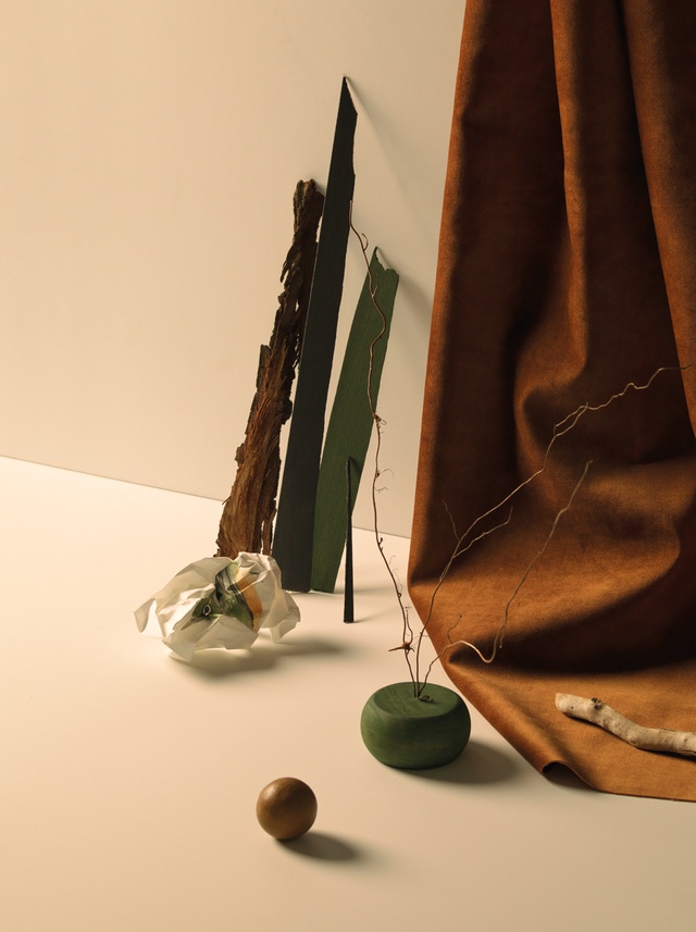
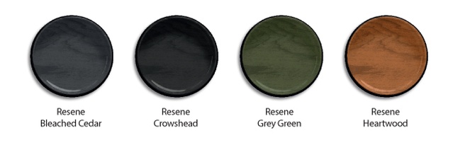
PE: Birds have obviously been on my mind lately and it’s a time of year when we see the tauhou (silvereyes) hopping amongst the bare branches of winter trees. I chose four Resene Woodsman stains that bore a close resemblance to their colouring to paint them with: Resene Bleached Cedar, Resene Crowshead, Resene Grey Green and Resene Heartwood. The materials in the collab are ones that you would associate with a bird’s habitat – the rough bark and the timber, twigs and branches – but these are also materials that you might use in an architectural sense in different forms.